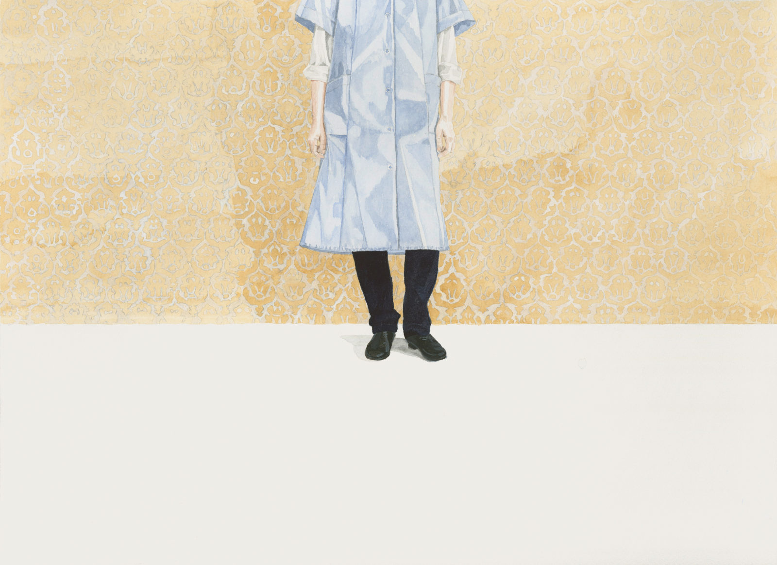
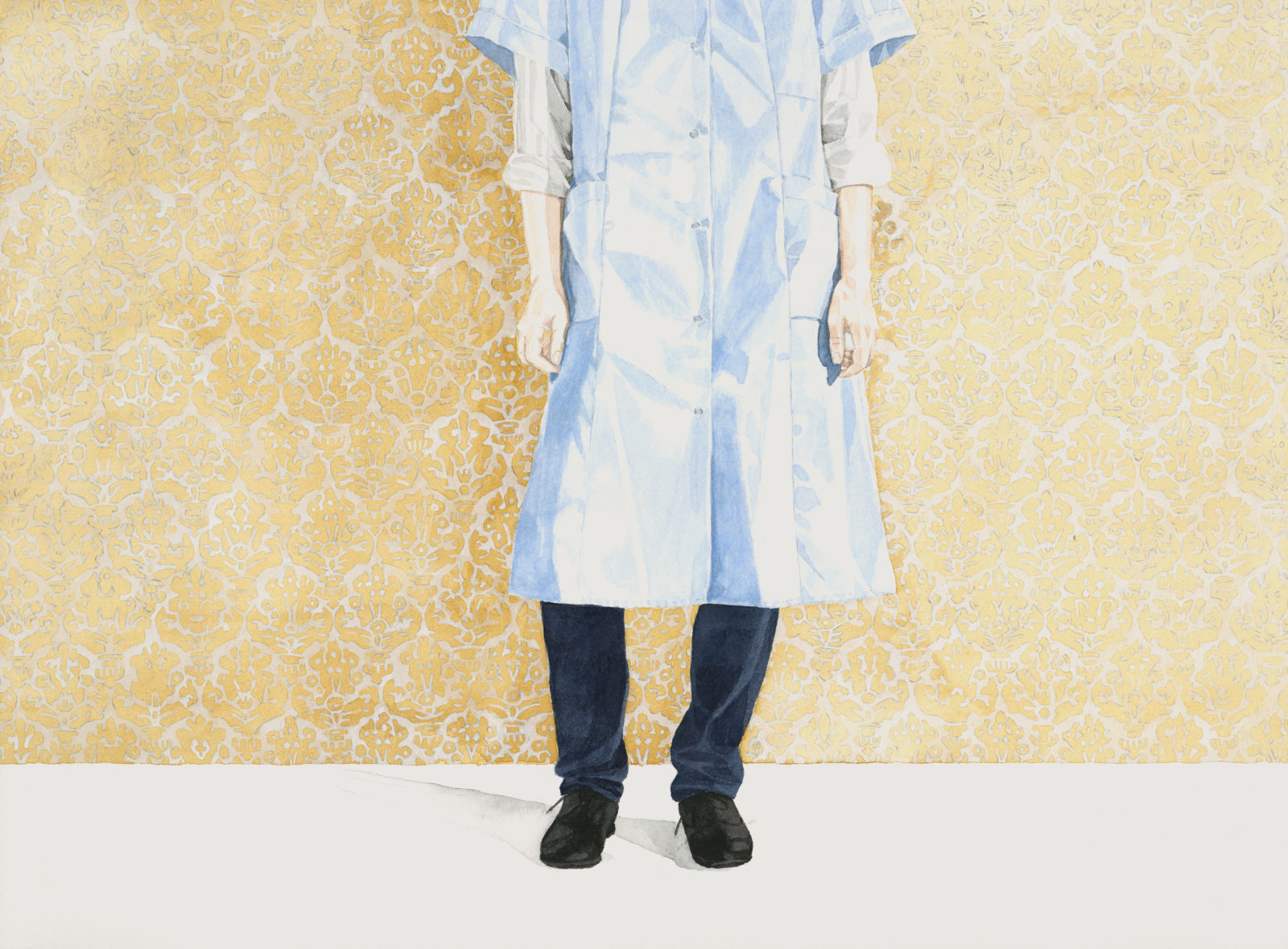
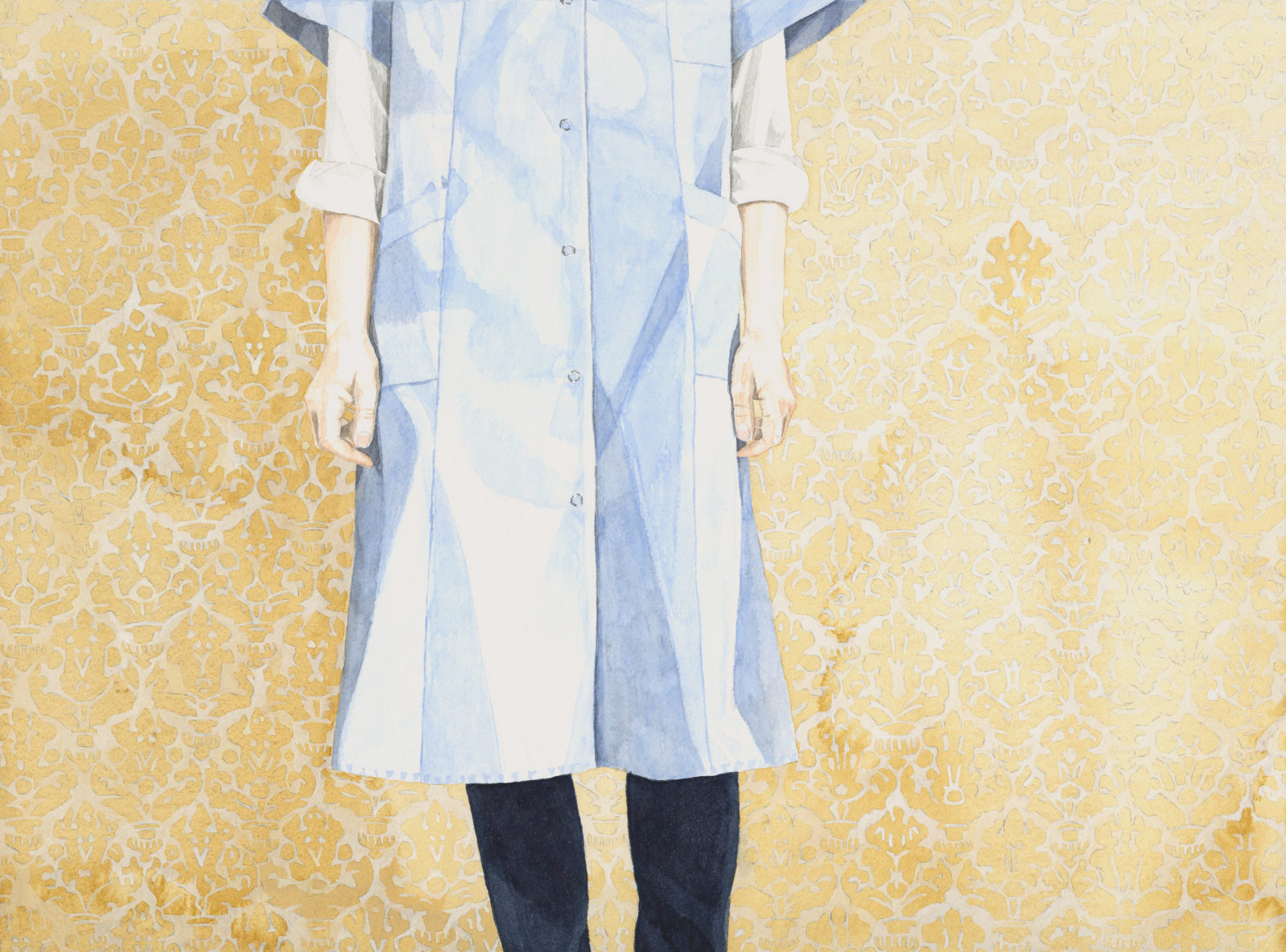
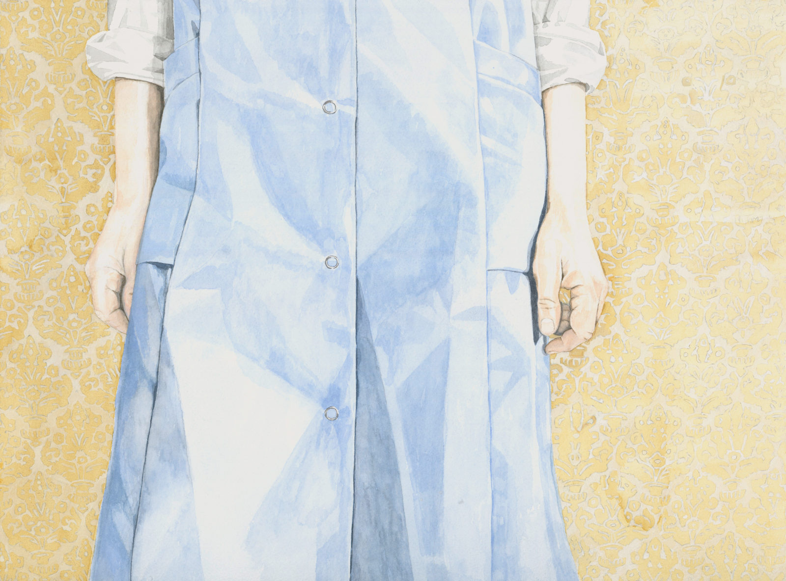
YESTERDAY TODAY TOMORROW
Meike Behm„Throughout, human beings still live in prehistory, indeed anything and everything comes before the world’s creation, as it should. The real genesis is not at the beginning, but at the end, and it only begins when society and existence become radical, meaning, to take root. At the root of history though is the working, creating person, who reshapes and reconditions circumstances. When a person has a deeper understanding of their being and establishes their very existence within real democracy, without estrangement and alienation, something can be formed in the world, which seems to all to have been in their childhood and wherein no one has ever been: home. „ (1)
This excerpt from the work, The Principle of Hope, by the philosopher Ernst Bloch conveys that „home“ is not a room or a place. Rather, it is a transitive state and its tension reaches from its origin and starting point and extends to a place of a better way of being, a utopia of an altered world, which must to be mastered. (2) On the contrary, people still do associate the concept of „home“ with their own things, smells, feelings, and family members.
The title Home Ground, Foreign Territory comes from the novel Surfacing by the Canadian writer Margaret Atwood. (3) A young woman returns with her friends to the island of her childhood in northern Québec to investigate the strange disappearance of her father. Flooded with memories, she begins to realise that going home means entering not only another place but another time.
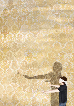
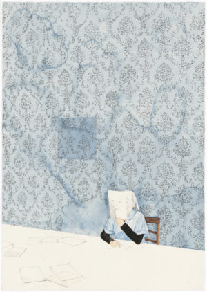
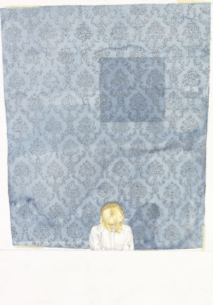
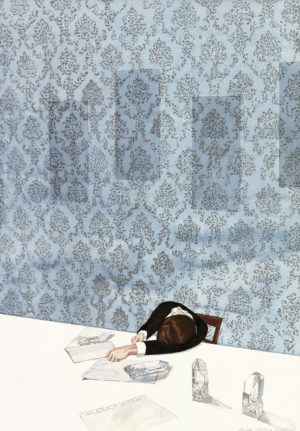
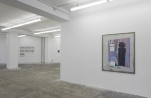
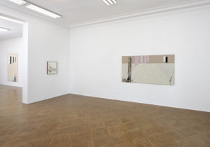
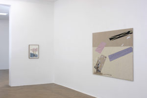
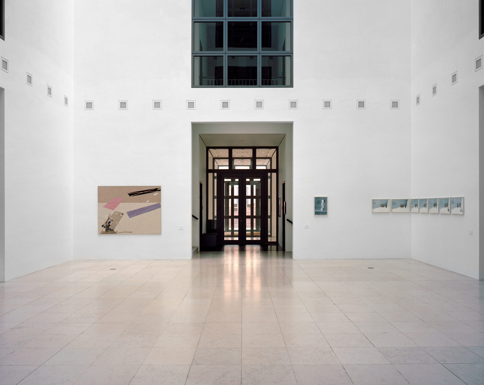
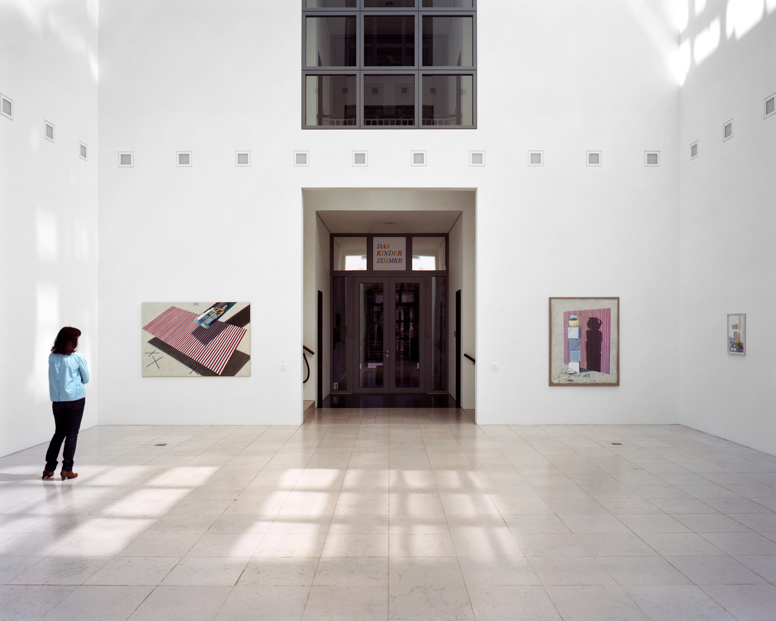
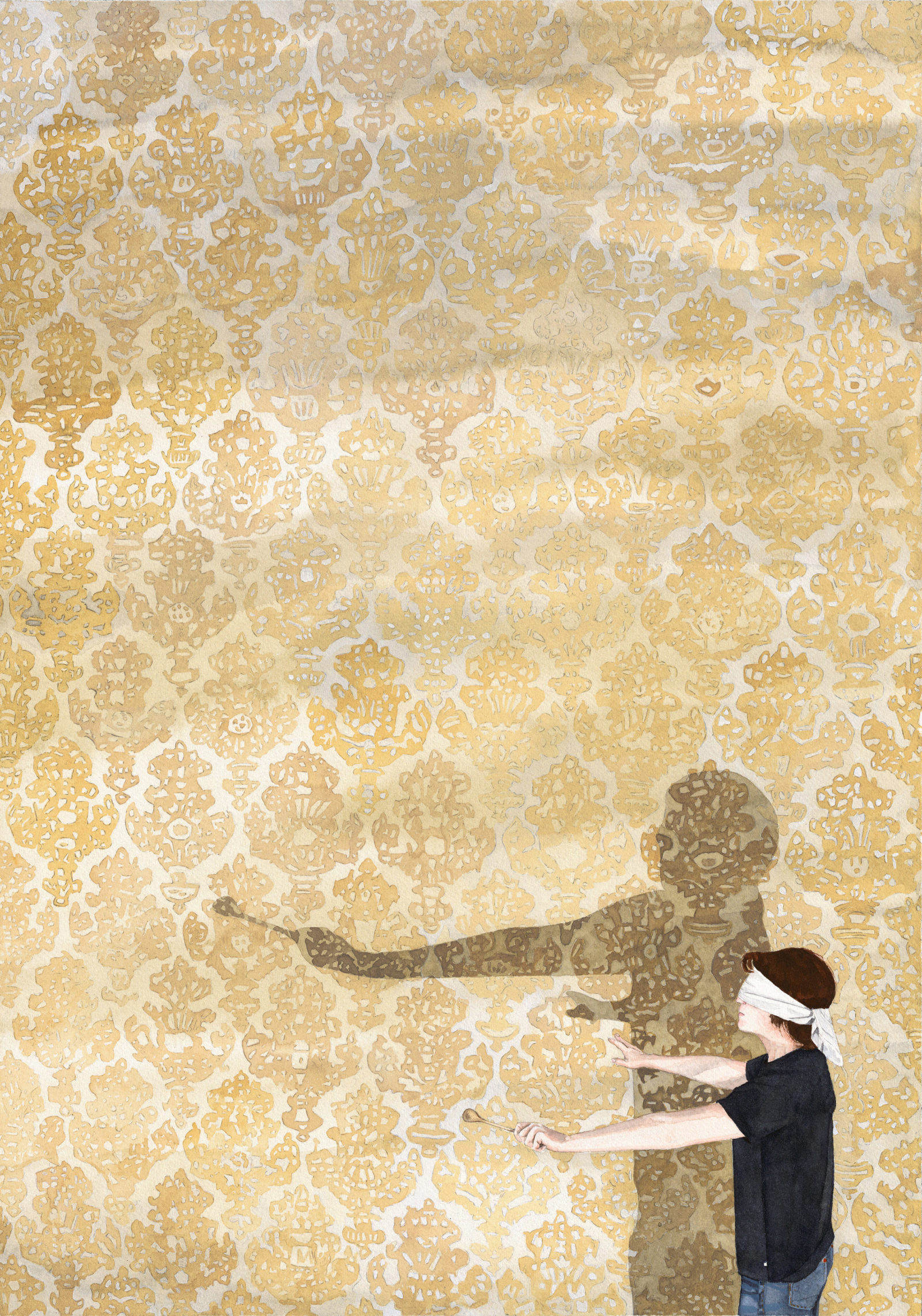
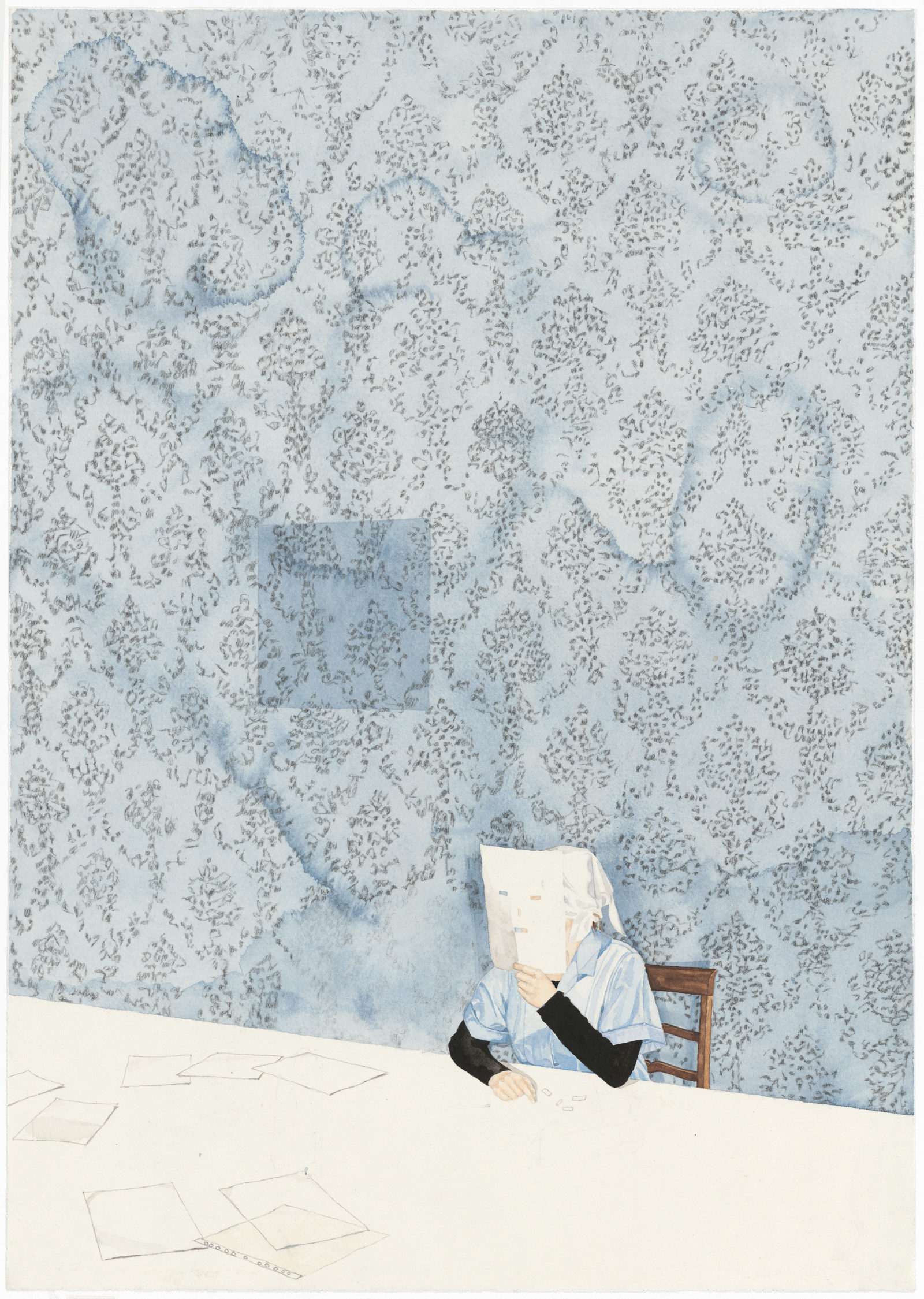
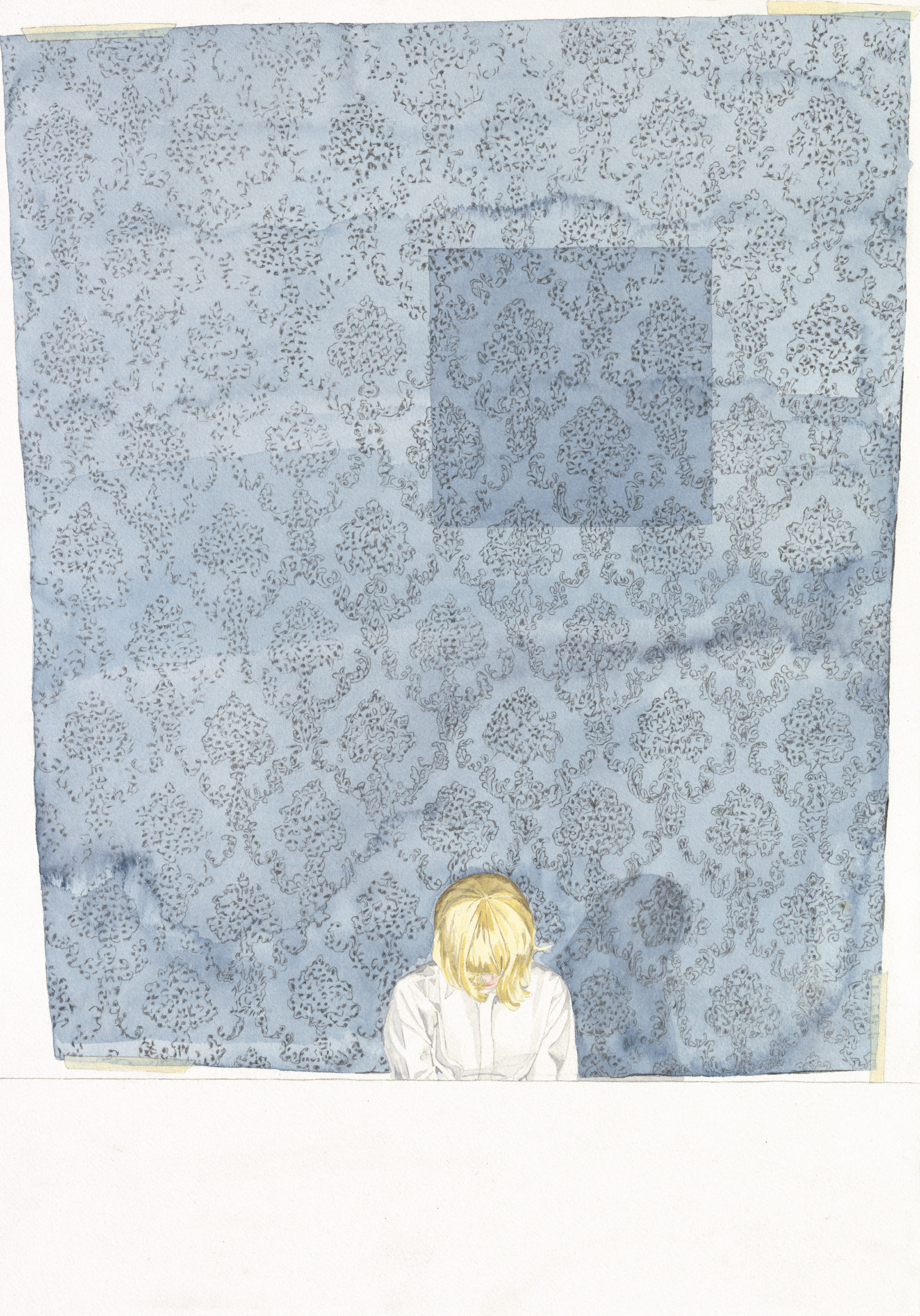
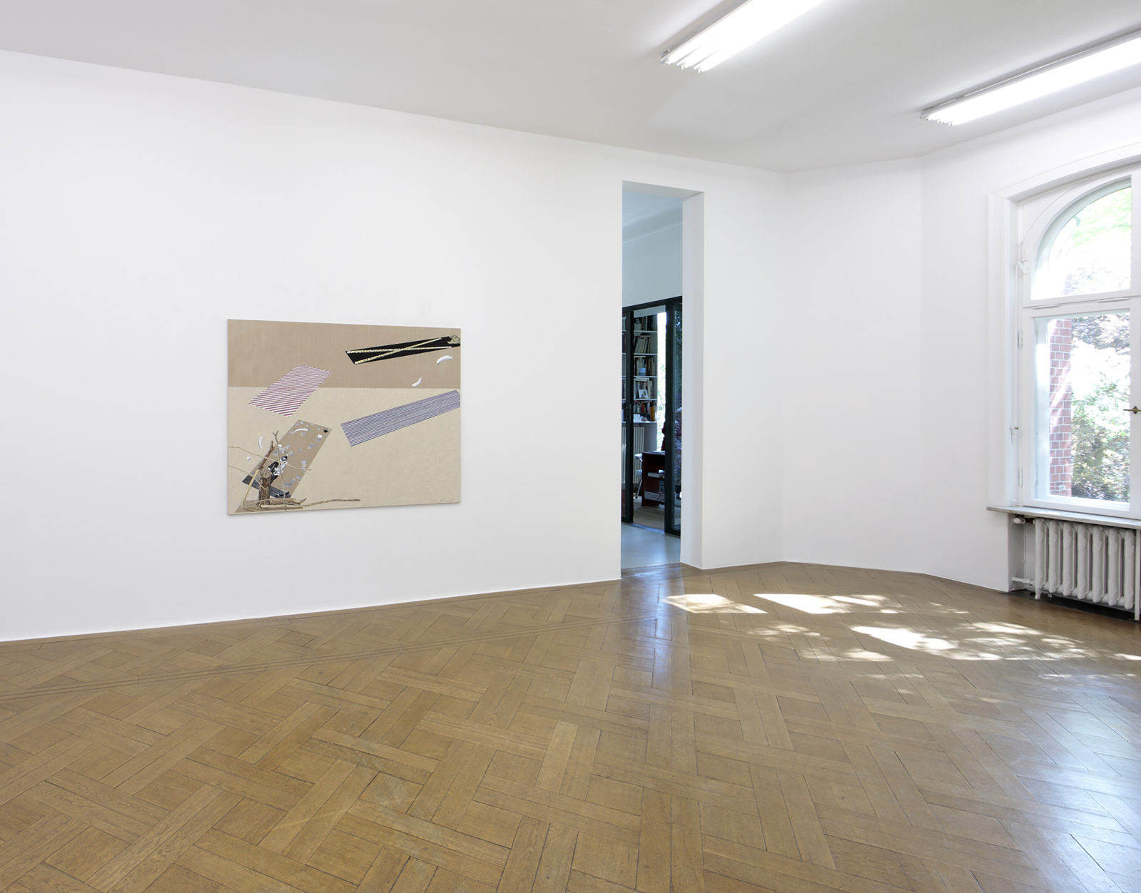
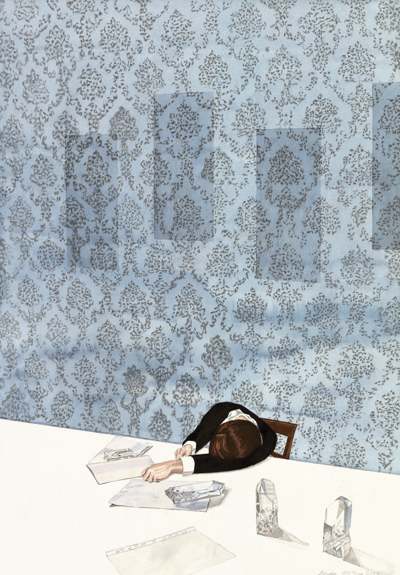
Linda McCue made some of the paintings presented here expressly for this exhibition, such as the works painted with oil and bleach on linen entitled Family Walls (2023 – 2024). All are small format, and all are dominated by a surface of a dusky rose, a light blue, or a mauve, each characterised by different ornamentation. (4) Upon closer inspection, they are reminiscent of fabrics familiar from museum walls, upon which Old Masters works still hang today, or the walls of German castles and Palazzi in Venice, which are covered with such fabrics.
In Venice, Linda McCue acquired such woven fabrics, some of which are no longer being produced there. Using a painting process, she then „translated“ them onto stretched linen canvases. Over a longer period of time, she meticulously replicated each detail of the various ornamention, making clear the difference between the quick machine-made production of woven fabric and the slow process of painting. The irregularity of the patterns rendered with paint contrasts with the regularity of their woven models.
The title of this series, Family Walls, also implies a connection between the concepts of „home“ and „family“. Patterns from wallpaper, sofa covers, or curtains shape our childhoods, yet this too is temporary, and even real, tactile surfaces fade and in retrospect, appear differently over time. When Linda McCue transfers patterns from a private context onto canvas or linen, a kind of irregularity and inaccuracy is conveyed, which is inherent in the phenomenon of memory.
Along with this, the phenomenon of time is also implied – on multiple levels. Both as working time – each of the paintings has many layers – and also the time that has passed since the end of the production of such textiles. It also becomes clear that ornament itself is a conceptual construct. (5)
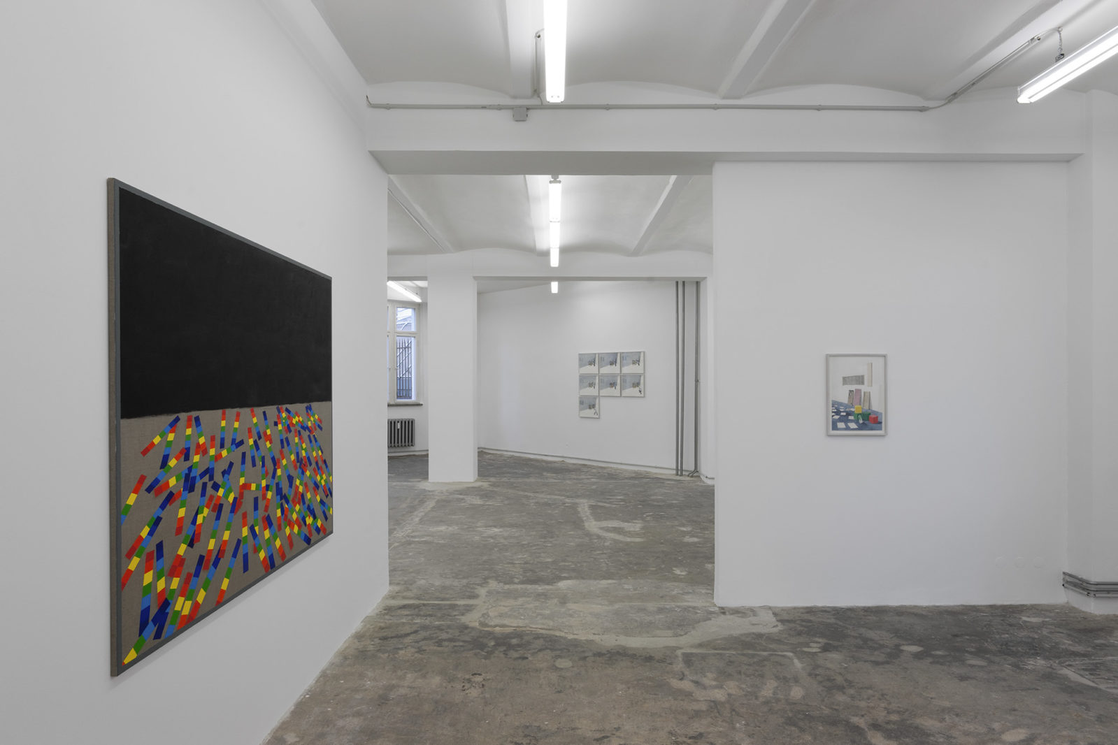
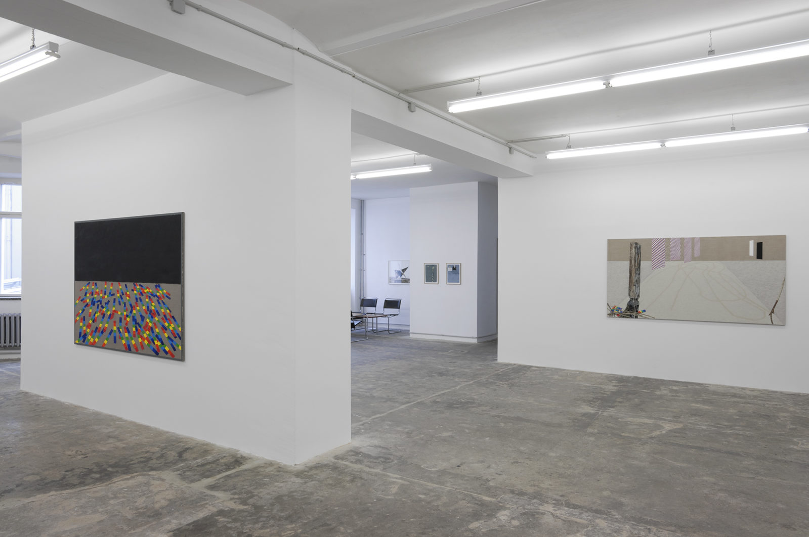
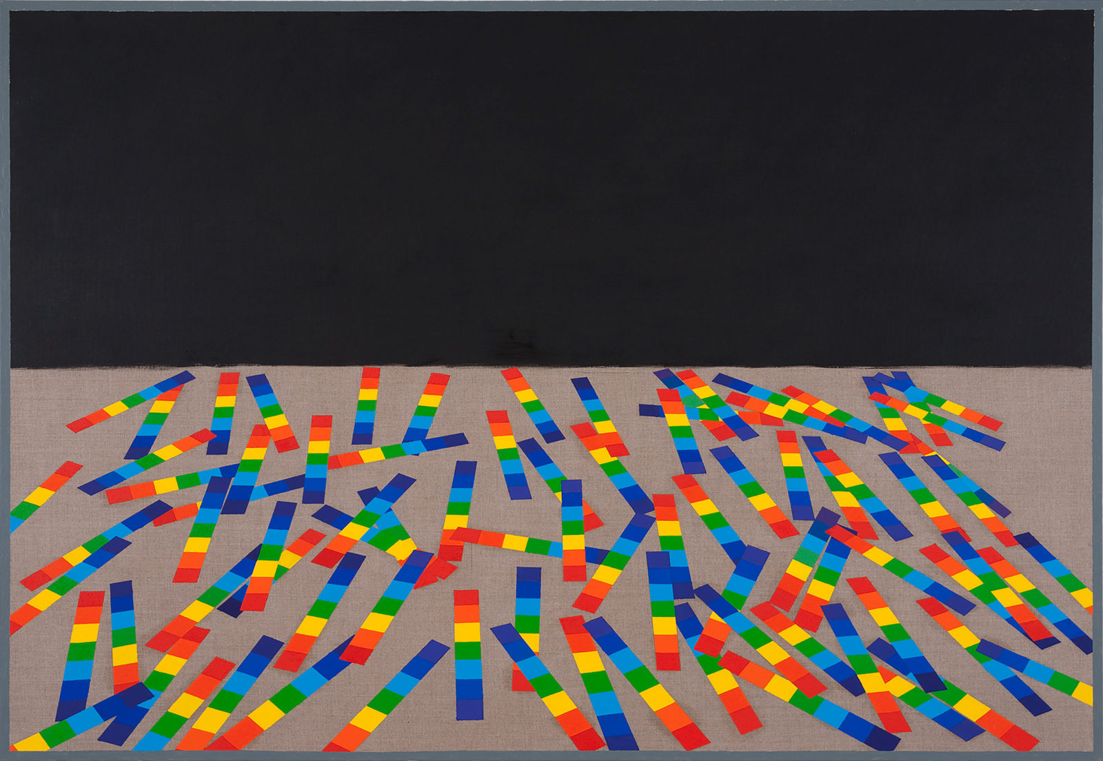
Upon closer inspection it becomes noticeable that the coloured areas of ornamentation never fill the entire pictorial space. These coloured areas are bordered by a sometimes larger, sometimes smaller bleached area of linen in the lower half to the painting. This makes it seem like, little by little, the monochrome surface overlaps the colourful, ornamental area in the upper half of the painting. Indeed, it even seems to drive it out. In the end, the modulating white surface dominates the colourful, detailed, ornamental surface: Modernism prevails over tradition!
I am consciously using the word „Modernism“, thinking about The Black Square, painted in 1913 by Kazimir Malevich. As the artist himself commented on this work: „ In 1913, when I made the desperate attempt to free art from the burden of objects, I exhibited a painting that was nothing more than a black square on a white ground. It wasn’t an empty square that I exhibited, but rather the perception of the non-object.“
The painting was shown in The Last Futurist Exhibition 0,10 in St. Petersburg in 1915. It was hung in the upper corner of the room, the place traditionally reserved for icons in Russia. (6) The Black Square is also a symbol for the victory of modernism over tradition. (7)
During a visit in her studio Linda McCue and I spoke in regards to her Family Walls series about the polemical essay Ornament and Crime (1909) by the Austrian architect Adolf Loos. (8) Against the backdrop of an overabundant ornamentation of historicism and the opulence of the Viennese Art Nouveau, Loos polemicised that the „Evolution of culture is synonymous with the removal of ornament from everyday objects“. (9)
With The Black Square and the essay from Adolf Loos in mind, it becomes clear that the Family Walls series on one hand addresses the possible victory of Modernism over tradition. On the other hand, the painting series doesn't advocate for an end to exuberant ornamentation. Rather, the series is characterised by an ambivalence, as it tells, in a non-judgmental way, of the gradual disappearance of traditions through technical and economic progress and of today’s changing ways of life. Traditional ways are in fact under the imminent threat of being replaced by newer and more efficient things. However, in today’s society, shaped by multiculturalism, both can stand equally beside each other.
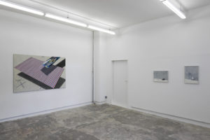
Similar themes are conveyed by Linda McCue’s paintings Blanket; Blanket -– Vertical; and Blanket – Horizontal (all 2016), as they are based on the geometric patterns which once adorned woolen blankets, transformed with the means of painting.
Pastel colours combined with vertical or horizontal stripes convey a sense of calm and order.(10) The original machine-woven patterns are translated by Linda McCue using a painting process, thus, the stripes do not always run straight, creating a divide between both the machine-made source material as well as bygone traditions.
In spite of clear references to the past, the obvious assumption, that Linda McCue’s choice of motifs is based on nostalgia and of regret in the face of the gradual disappearance of traditions, is false. This becomes clear when looking at the small painting The Gatineau Hills (2019). A dominating area of alternating shades of pink appears over pixilated hills, painted in green. The title, The Gatineau Hills, indicates the place on which the painting is based: a hilly landscape in the Ottawa Valley, close to the city of Gatineau in Québec. (11)
This painting uses distance as a medium – temporally, as it is from 2019, as well as technically, as the work is inspired by a label from a Canadian woolen blanket. The painting speaks to the phenomenon of memory which is sometimes schematic and often generates images which do not correspond to the real appearance of things – in this case, those of nature.
In this sense some of Linda McCue’s work does reflect biographical aspects. (12)On the other hand her work refers to social and societal change which can be observed globally – in an ascertaining and observational rather than a reproachful way.
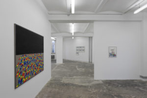
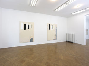
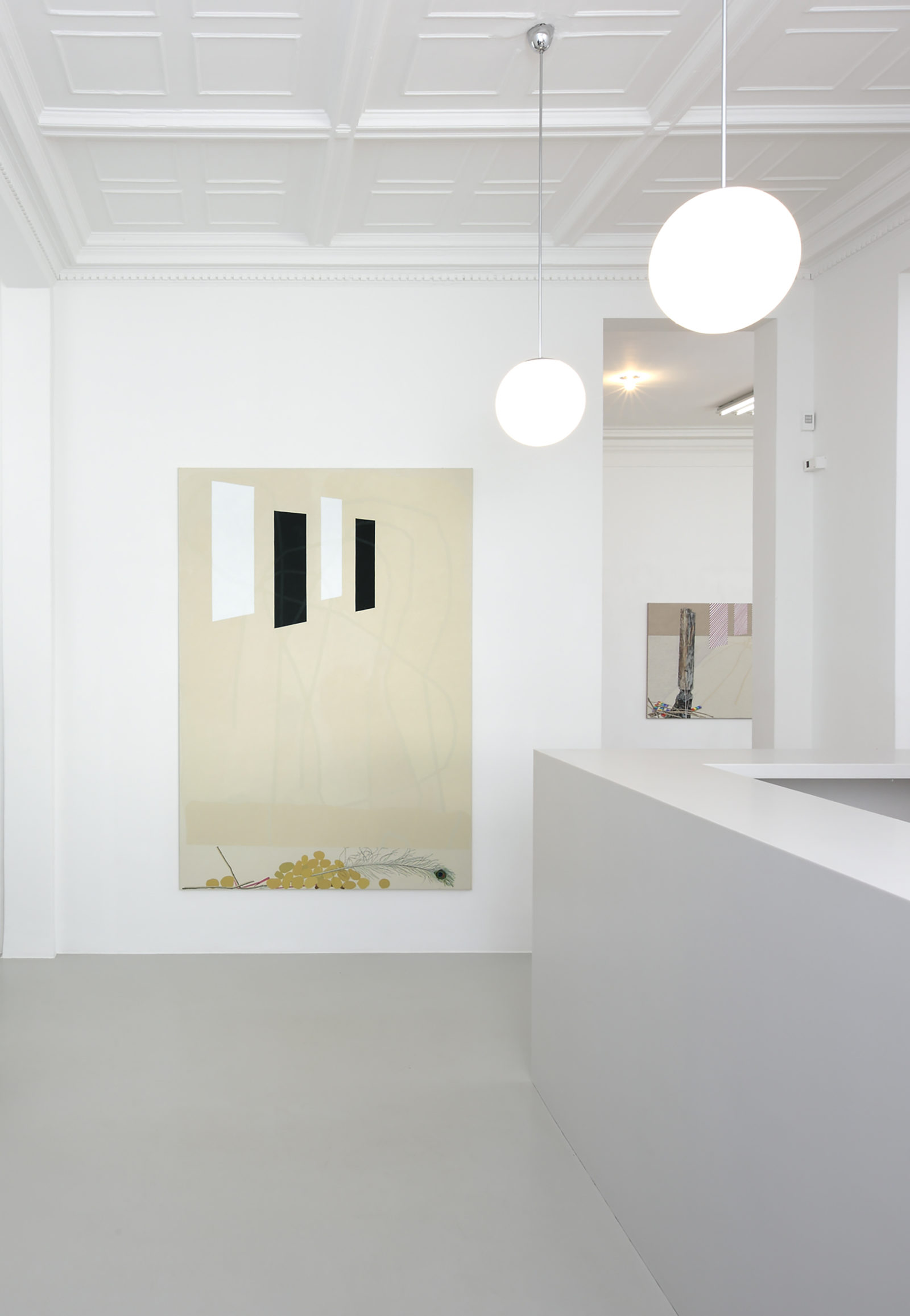
The paintings titled 1st, 2nd, 3rd and 4th Road (all 2018) convey another aspect. Each is characterised by a monochrome white area, dividing the picture plane in some instances vertically, in some horizontally, denoting the white road markings which regulate traffic. This white is bordered by an area depicting very small elements, dark grey and small red structures, bringing to mind the surface of streets. Here there are no patterns which form the subject of the painting, the work refers to asphalt. (13)
The detail and irregularity of these structures are emphasised by their correspondence to the white, 25 cm area, recognisable as road markings. In doing so, attention is directed to the surfaces of streets. Metaphorically these works can be read as an artistic interpretation, a description of a neutral territory or a state of in-between. A state which characterises the world today and which for many people forms a way of being.
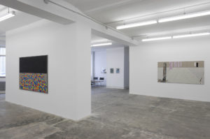
Some of the paintings in the exhibition Home Ground, Foreign Territory refer to emotions and perceptions which can set in upon the return to a place and time which was once very familiar.
Emotions which affect many people today, in a time when two wars shape our thoughts and actions as well as those of politics and society; People who, if they can return at all, will find that the place they return to will likely appear entirely foreign to them.
Ernst Bloch understood „home“ as the perspective of a state in which we aren’t yet in, but which appears to all of us to be „in our childhood“. Something we had a notion of in our childhood memories, which can only become clear to us from a distant perspective. With Linda McCue’s work in mind, a possible realisation can be to direct human thought and action not in replacing culturally foreign patterns, customs, and traditions with new or contemporary ones. Rather, to let both exist beside each other, on equal footing. Perhaps this will make the return to another time and to a place that is no longer familiar a little less foreign.
1. Ernst Bloch, Das Prinzip Hoffnung, Frankfurt am Main 1959. p. 1628. Bloch understands „home“ in two respects: the homeland where a person was born, and also the home which the person wishes to create, which appears as being part of the utopian ideal of the childhood state.
2. Ernst Bloch (1885 – 1977) wrote Das Prinzip Hoffnung (English: The Principle of Hope) between 1938 and 1947, in the time of National Socialism and World War II.
3. See Margaret Atwood, Surfacing, Toronto 1972.
4. Each painting in the Family Walls series is 50 x 40 cm
5. See a.o. the drafts and designs for wallpaper and fabric patterns from William Morris (1834 - 1896). He was the primary proponent of the British Arts and Crafts Movement, which aimed to combine art, handicrafts and traditional manufacturing processes.
6. See https://de.wikipedia.org/wiki/Das_Schwarze_Quadrat
7. See https://de.wikipedia.org/wiki/0,10. Both men and women participated in this group exhibition, which was held in a gallery in St. Petersburg from Dec. 19, 1915 - Jan. 19, 1916.
8. See article on Kazimir Malevich in: Lexikon der Kunst, Band IV, Leipzig 1992, p. 496. Malevich (1878 –1935) painted several versions of The Black Square, the first version from 1913 was 79 x 79 cm.
9. The text is the manuscript of a lecture held by Adolf Loos in 1908 in Vienna. See Franz Glück (ed), Adolf Loos, Sämtliche Schriften. Band 1, Wien München 1962. S. 276–288.
10. See ibid and Annette Tietenberg, Das Muster, das verbindet, in: Petra Schmidt, Annette Tietenberg, Ralf Wollheim (ed), Patterns. Muster in Design, Kunst und Architektur, Basel Boston Berlin 2005. p. 6
11. In this area there was a cottage Linda McCue’s grandparents used in the summer and where she often visited them.
12. Linda McCue has not lived in Canada for a long time, she lives in Hamburg and visits her homeland only from time to time.
13. Linda McCue asked the road workers who were renewing the road in at the Hamburg Dammtor train station to give her pieces of the old road that had been broken up. Those pieces form the basis for this series of paintings.
Meike Behm
Meike Behm
YESTERDAY TODAY TOMORROW
Meike BehmA VEIL IS A CURTAIN IS A CANVAS IS A LETTER
Crystal MowryI would like to write like a painter. I would like to write like painting.
– Héléne CixousSome paintings seem to want language. A linguistic apparatus upon which to hang meaning. An explanation. A translation. An appendix to ensure that its viewers can readily source its meaning. A handy shortcut to its intentions. A confirmation of its relevance.
Some paintings, however, seem to want language if only to reveal its inexactitude. And yet, it would be negligent, perhaps foolhardy, to craft a discussion of Linda McCue’s painting without giving their physicality a textual equivalent. Others have found it difficult to resist the lure of McCue’s technical precision, a description of which can quickly turn into forensic prose. And no wonder, McCue’s paintings are beguiling examples of a similar sort of scrutiny applied, rather, to everyday objects in what could be seen as form of transition. Whether it is a decorative plate, a swathe of fabric, or even wallpaper – in relocating these effects from the space of familiarity (the home) to a conceptual space (the canvas or paper), McCue creates subtle images that remind us of what Philip Guston called the “impure” in a painting. Guston, knew full well that the perceived consciousness that kept Modernists believing in abstraction as a “truer” pursuit, was contaminated by embodiment and experience. Despite attempts to suggest otherwise, paintings are still things in the world – a world filled with numerous other objects and their likenesses.
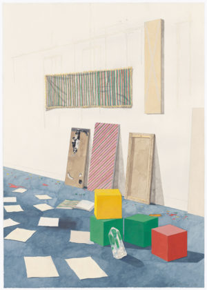
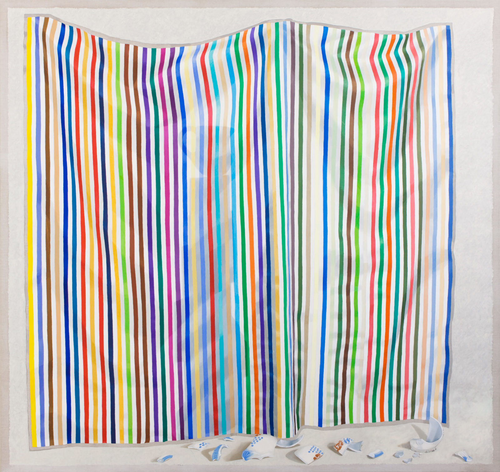
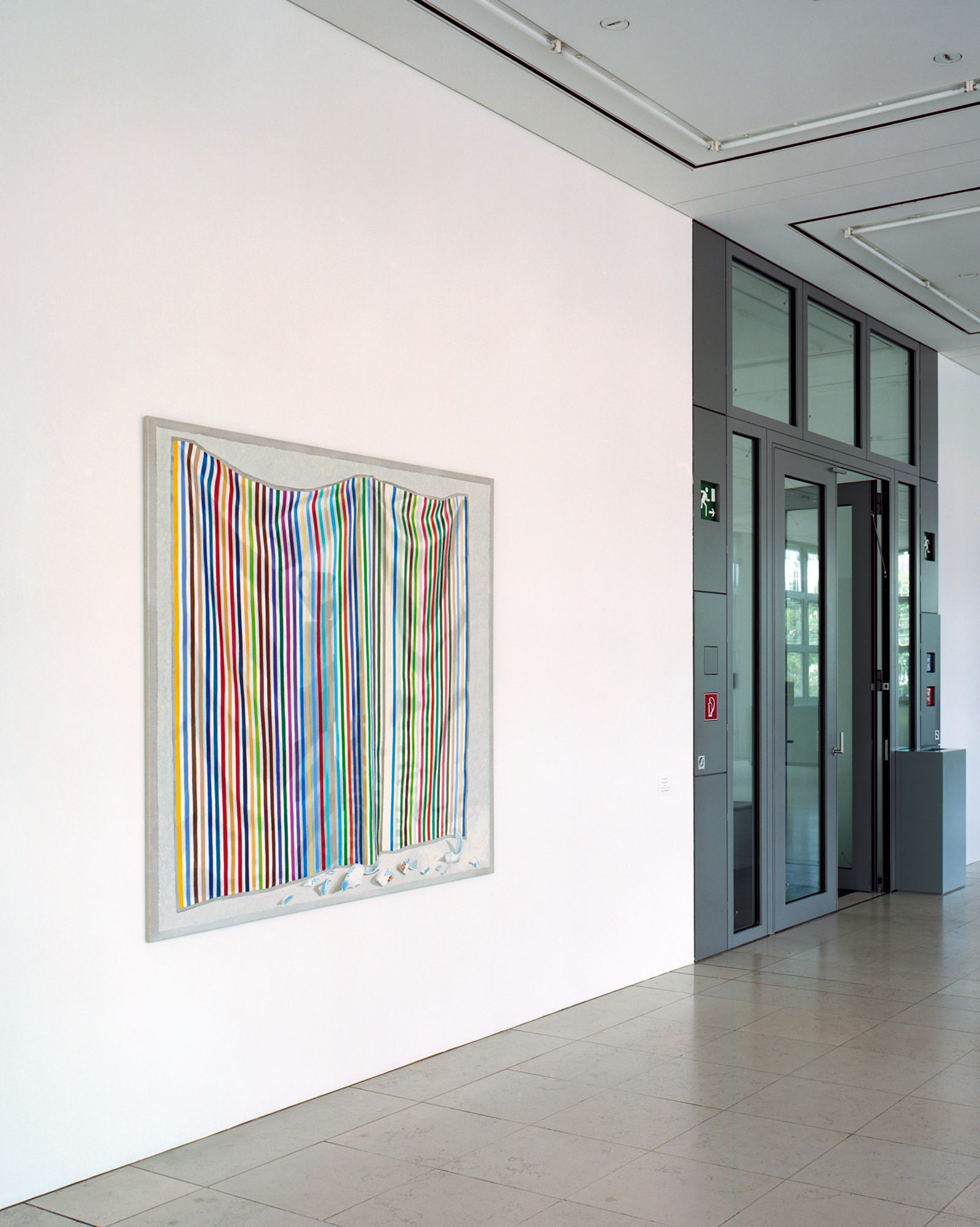
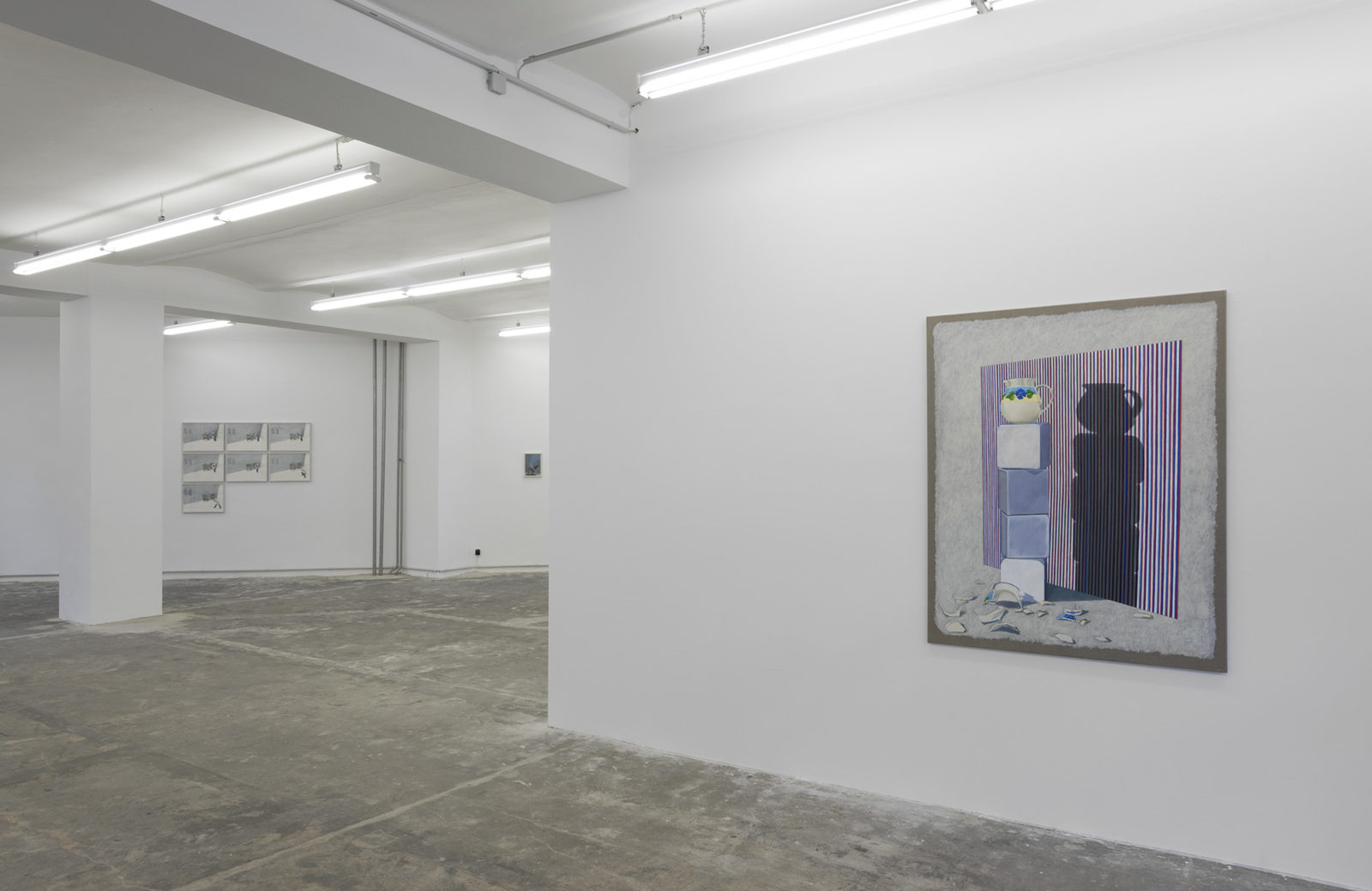
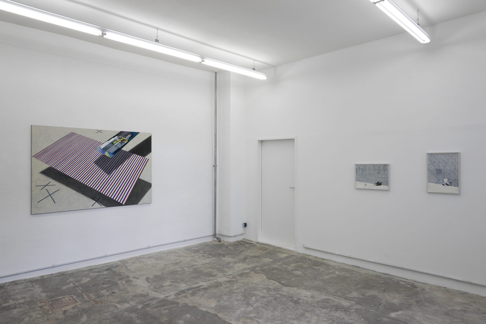
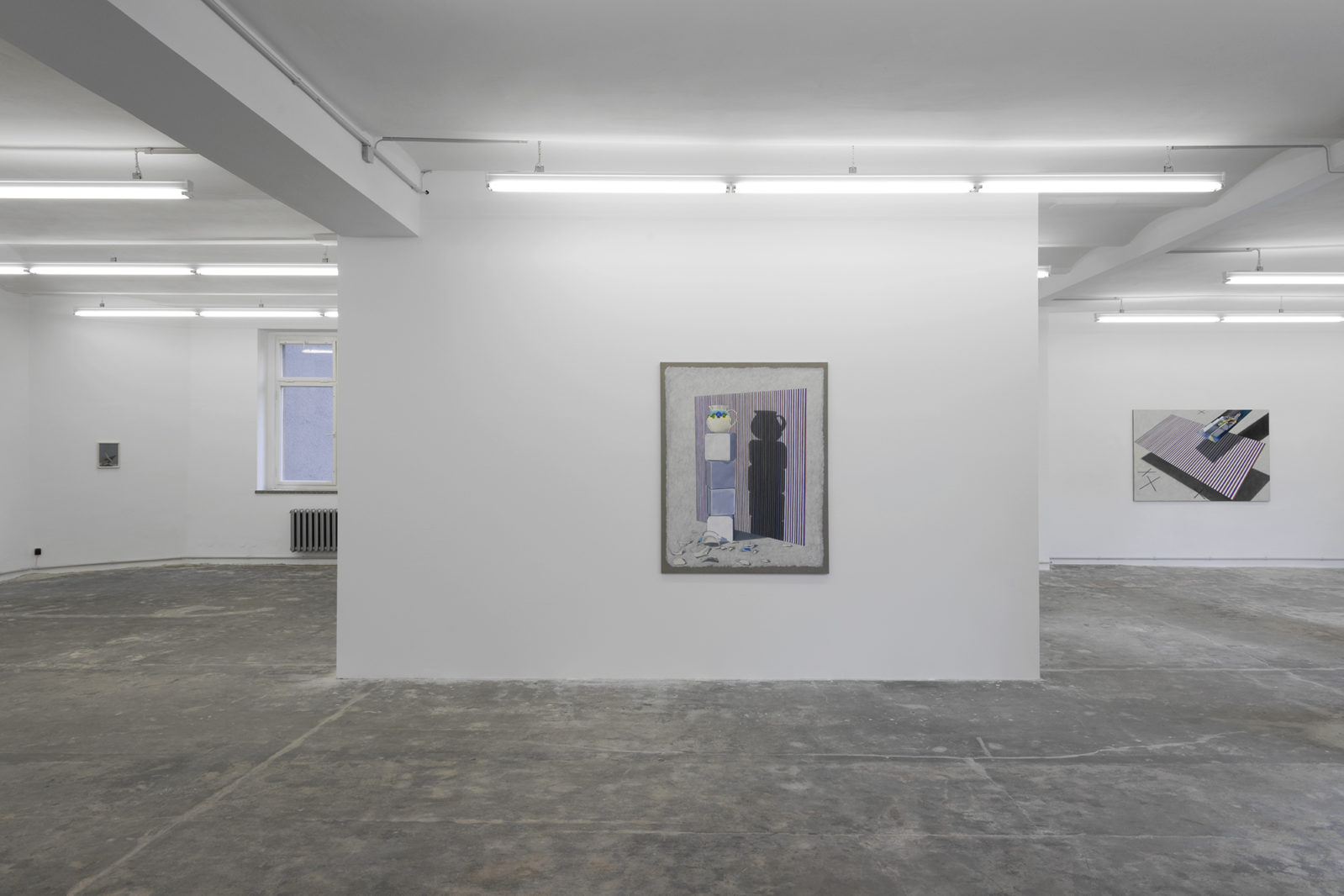
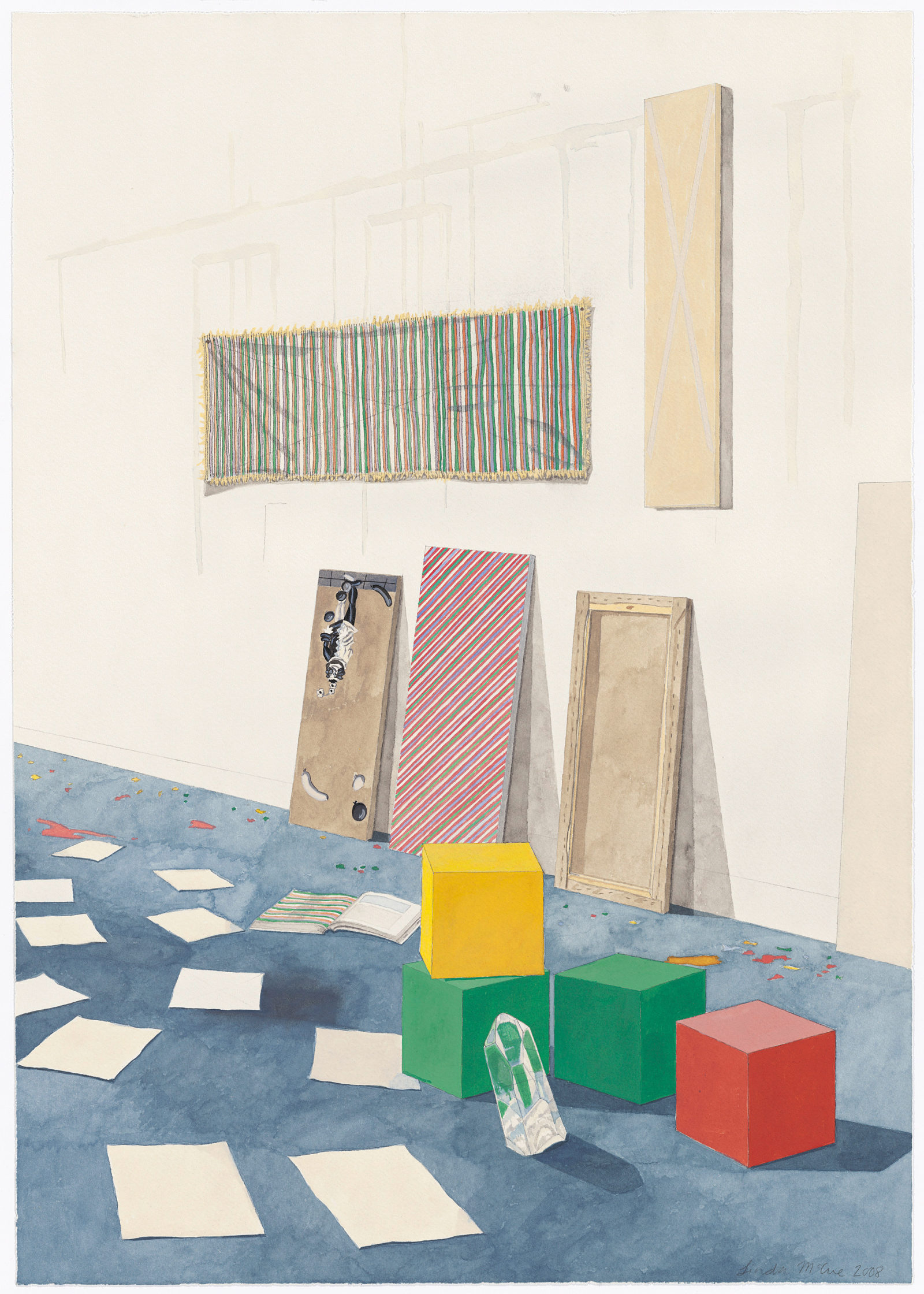
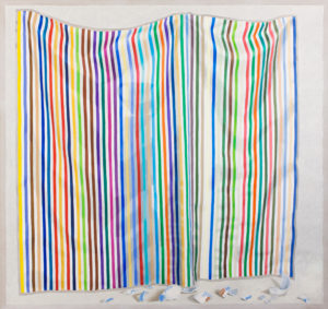
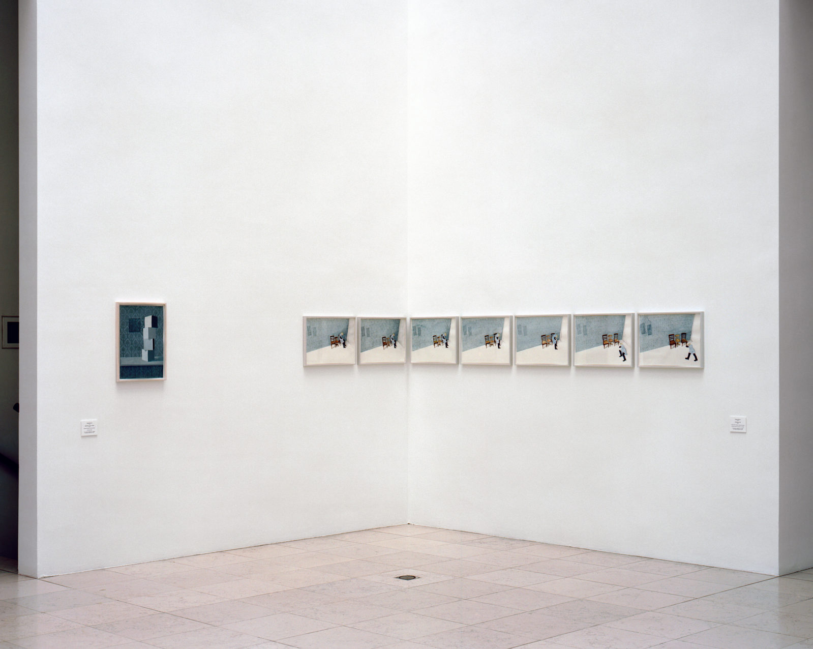
McCue has dedicated her practice to what can be seen, how it is seen and the dilemma of making that experience concrete for others. She rarely works from images or resource photography, rather opting to produce her work primarily through observational study. This also applies to the elements in her paintings which might initially register as abstract forms. A white square might be an abstract form, but it is also just as likely to be a representation of a curtain or a Kazimir Malevich painting. In the work entitled The Jug of Silver (2010) (p. 23) McCue offers us a composition almost entirely occupied by the semblance of another painting. A piece of striped fabric hangs provisionally across the composition, like a Bridget Riley removed from its stretcher and made subject to gravity. On the draped fabric is cast the shadow of a vessel precariously balancing on vaguely geometric forms, while the fragments of a ceramic vessel are scattered in the foreground. McCue’s process for making this work included the painting of a swathe of striped fabric first – a type of prototype – that would then become the subject in The Jug of Silver. While serving a practical purpose, this process also contributes a complexity to McCue’s handling of references to the history of abstract and representational pictures. In effect, McCue is creating a likeness of – or a reference to – the thing that is created to address vision specifically without the language of representational images. It is a heady proposition that allows us to see the other Jug of Silver (pp. 29,31) works in a different light. Drawn two years after the first, they depict teetering stacks of white cubes are situated against ornately patterned walls. Are we to see these white cubes as practical elements for displaying other objects, or are we to see them – and all their attempts at neutrality – to be the real subject? Here is where the Modernist project becomes the Conceptualist conceit for McCue.
A similar tactic is at work in Target (Doris) (p. 15) and Target (Pink) (p. 9), made in 2012 and 2013 respectively. McCue treats the target as a surface which is both diaphanous and undulating – qualities that deflect any precise aim. McCue’s practice is full of what might be read as purposeful nods to the modern / abstract canon in painting: the concentric circles – a Kenneth Noland or Jasper Johns citation, the wordless letters of Agnes Martin channelled through an interrupted floral motif, and the white squares of Malevich positioned as both blank paper and allegory. Here the language of “pure thought” co-exists with the quotidian, the artist’s every day surroundings and the studio as a type of mediative space.
In speaking of what contemporary art has inherited from Modernist and Conceptualist strategies, critic Barry Schwabsky is clear on how this extends to painting: “A painting is not only a painting but also the representation of an idea about painting. That is one reason there is so little contradiction now between abstract and representational painting: In both cases, the painting is there not to represent the image; the image exists in order to represent the painting (that is, the painting’s idea of painting).” If we are to understand that abstraction’s role was to make visible all that is desirable or redemptive about formalism, as was outlined in the writings of Clement Greenberg, what then does it mean to engage in a type of meta-language, a representation of abstraction as merely one strategy of seeing things in the world? McCue reminds us that questions such as these are as much a matter for painters as they are for those who look at paintings.
Published in
THE MATERIALS
Textem Verlag, 2015Published in
THE MATERIALS
Textem Verlag, 2015A VEIL IS A CURTAIN IS A CANVAS IS A LETTER
Crystal MowryTHE CONVERSION OF THE COMMONPLACE
Jens AsthoffThis catalogue is called The Materials, the name Linda McCue also gave her solo exhibition in the Galerie Vera Munro in November 2013. The term, quite unspecific if taken alone, which McCue uses twice in a prominent place and explicitly in the plural, makes a general reference to (working) material, but also to (textile) fabrics. This emphasis on something purely material implies, in a literal sense, an unfinished or prefabricated state, as if something were to remain formless, merely material, destined or calling for further processing. Yet Linda McCue's paintings and drawings appear to be anything but formless or even unfinished. On the contrary, with regard to composition and artistic realization, they are characterized by absolute precision and a distinctive sense of form. In fact, things are clearly shown here in their pure thingness, somewhat prosaically as "material", often in loose arrangements. A form of portrayal characteristic of McCue’s works that on the one hand emphasizes their purely material quality: here the texture of fabric, there a fold, or the breaking edge of a piece of porcelain with a typical flow-blue glaze – the materiality of things is documented everywhere in precise trompe l'œils. On the other hand, this way of showing things makes it possible to play with the sense of the momentary and incidental. Often, the things seem to have been loosely spread across the canvas, supposedly randomly, as if they could lie differently at any moment; as a compositional method this always has the effect of being airy and free, for example in paintings such as Geneva/White Square (2011 – 2013, p. 11) or, in a different way in Target (Pink) and Other (2013, p. 9). And it is in particular the precise, objective painting by McCue which here generates dramatic tension and hence sparks an even cleverer play with composition and impressions of reality from a seemingly arbitrary arrangement of broken fragments, which one perhaps initially reads as "uncomposed". As randomly as a cloth creates folds, as incidentally a shattered porcelain plate comes to rest – for McCue the pictorial composition contributes above all to giving such arrangements of things a sense of lightness, while maintaining a very tight composition throughout, each element in its right place and nothing superfluous. Seen from a painterly perspective, McCue's works always deal with the difference between the imaginary and real pictorial space. The objects are mostly painted directly onto the raw canvas, previously treated only with transparent gesso. Hence the motifs appear isolated from the background. The shadow cast by the things and the transparency of the fabrics also add to the realistic impression. However, the illusionistic pictorial space ends rigorously at the edges of the objects themselves. This is because the raw canvas is a compositional element of the painting, supplementing it with what it really is in terms of material: not an illusionary space but a piece of fabric stretched flat. Hence as much as McCue on the one hand intensifies and exaggerates the real character of what is portrayed – the objects appear tangible on the canvas – on the other hand she consistently breaks with the painterly appearance. These are still life paintings that artistically stage their own illusionism, unmasking it in the same moment. Such aesthetic aspects, located in the genre of painting, and a consistent criticism of its role as an illusionistic medium, is a central theme in Linda McCue’s artistic work. A problematic topic that has preoccupied artists for centuries and was already touched upon with Plinius' transmission of the ancient painting competition between Zeuxis and Parrhasios. According to the narration, Zeuxis succeeded in painting grapes so realistically that birds wanted to peck at them. However, Parrhasios was able to outplay his colleague by painting a curtain so realistically that Zeuxis himself attempted to pull it aside to look at the actual painting he presumed to be behind it. In the genre painting of the 17th century, the painterly game of shifting the boundary between the image and reality was often brought to a playfully-effective climax, for example by the Flemish and Dutch painters Cornelis Gijsbrechts (before 1657 – after 1675), Evert Collier (1642 – 1708) and Samuel van Hoogstraten (1627 – 1678). Gijsbrechts painted a picture with the title The Reverse of a Framed Painting (1670) on which he portrayed, deceptively real, the rear of a painting, in other words the wood and outer frame including the shadow gaps, and on the interior a piece of canvas with the fabric-like texture and the base coat showing through a little – just as if someone had really hung a picture the wrong way round. Historically, Lucio Fontana's (1899 – 1968) penetration of the canvas could be considered another extreme that counteracted absolute illusionism.
In McCue's painting, on the other hand, although the canvas is "real", so is the illusion of the painting. In this sense the bare untreated canvas marks the exact boundary of the illusionistic pictorial space with reference to the subject. As part of the picture itself – a semantic ambiguity typical of McCue's works. Such aspects of image and representation are also further interpreted in her more recent works with regard to the motif. For example, McCue links the painterly portrayal of objects with their absence: the small-format works in Geneva (a, b) (2012, p. 70/71), Geneva II (a, b) (2012 – 2013, p. 72/73) and Currier & Ives (a, b) (2013, p. 68/69), all something like minimal versions of a still life, each show a plate with a blue and white porcelain painting and to the right, on a second canvas, only a grey-brown, round mark in the same place. Hence the painterly simulation of the pale shadow of a plate that has been removed after a long time is created – an image of its absence, which also introduces an indeterminate moment of temporal duration. While the one painting can be read as the trace or virtually the lack of the actual motif, in the other, the portrayed object is also a picture: a decorative plate. In Geneva II, for example, one sees a piece of British "Royal Doulton" porcelain with a picture of Geneva, alternating idyllic scenes with mountains, trees and goats. This china, designed around 1910, is no longer produced, however it was once popular. A similar thing applies to Currier & Ives: McCue named this painting after a former US company, which produced folk-like scenes that were later printed on porcelain and became popular mass commodities. The plates, which McCue painted in a ratio of one-to-one, hence also stand for a transformation of media: the (kitsch) painting, simulated using lithography and print on porcelain, is here practically translated back into a real and virtuoso execution of a painting.
The shadowy empty spaces in these paintings allude to other works. The previously-mentioned Geneva/White Square, for example, portrays fragments of blue porcelain scattered across the pictorial space. This is indeed a reference to a work that McCue painted in Geneva a, b(2012, p. 70/71) in an unbroken state, with its shady double. An attentive viewer would be able to discover this by directly comparing the fragments – a broken picture within a picture, in fact not a single piece is missing. Further paintings are also based on this compositional principle of the broken whole, for example the small Study, Geneva (II) (2014, p. 51) or the two-part Doris (a, b) (2012, p. 46/47). In such paintings, each broken fragment casts an extremely short shadow, as if the light were to fall frontally on the picture or, if perceived as a horizontal surface, from above. In this way, McCue creates the impression of an extremely flat pictorial space – with a greatly enhanced object presence.
McCue also frequently works with citation as an image-creation procedure, for example when she alludes to artistic approaches such as geometric abstraction, and more specifically to artists such as Kenneth Noland or Bridget Riley. At the same time she interweaves this with handicraft or artistic conventions: in Geneva /White Square, for example, a white quadrangle appears and it is not directly evident if it is an autonomous, abstract motif, or simply a piece of white gesso base coat, which serves to distinguish the painted, similarly-sized, transparent cloth with its horizontal black lines, from the background. The cloth and the square form fore- and background, slightly offset, while the slight sag of the material breaks the strict Riley-like pattern of stripes up into a soft undulation. Such painted cloths, which appear frequently as a motif in McCue's paintings, are made by the artist herself as props, using the silk painting technique that she learnt especially for this purpose. The pictorial element hence aims to create at least three levels of reference, some of which stand in contrast to another: on the one hand the special materiality of semi-transparent silk as the motif of the painting and on the other hand the art-historical reference, as well as the "genre" of silk painting, which leans somewhat towards handicrafts. McCue has always mixed cultural values into her works, combining the high and low: hence a striped picture, such as in Target (Pink) and Other, that could be a vague reference to Bridget Riley, or might also be reminiscent of paintings by Kenneth Noland, also has the somewhat hobby-like connotations of silk painting. When McCue initially paints something on silk, only to then paint it again, in a second step, on a coarser canvas, it also shows her characteristic sense for the transfer of material.
In more recent works, McCue has further developed the pictorial principle of these ambiguous empty spaces, which had previously appeared in Currier & Ives. Geneva, 11 Circles (2014, p.63) and paintings from the series Real old Willow, 44 Circles (I-IV) (2014 – 2015, p.53 ff.) mark an revealing transition in this development: in the first work a decorative plate with a Geneva motif appears once again, incorporated into a serial pictorial grid of three by four identically-sized circles. The constellation allows for an ambiguous reading: are these abstract forms contrasted with a figurative representation? Or are the pale grey shadows really the traces of eleven more absent plates? The works of the Real old Willow series are also based on the pattern of a twelve-part grid. In contrast to the aforementioned work, the circles are staggered concentrically. The visual pattern, used here once again, is indeed an art-related citation: McCue is referring to Eva Hesse's circle drawings (p. 99) from the 1960s, which themselves combine minimal abstraction with underlying physical presence. As in Hesse's works, in the Real old Willow works there are also four differently-sized circles set concentrically on top of one another, with shading that becomes darker towards the center – this is portrayed eleven times and for this reason McCue names 44 circles in the title. Only the plate motif itself, the clearly figurative part of the portrayal, has not been counted. Next to the circles, which develop a somewhat Op Art spatiality, hovering a little above the canvas, the plate forms an astonishing contrast: and as a picture within a picture it is also a figurative representation in a double sense. There is a formal coincidence between the plate and the circles: here in fact not just one plate is portrayed, but four differently-sized examples, which lie on top of each other like a place setting, based on the same pattern as Hesse's circles. Just the uppermost plate, which is also the smallest, shows the chinoiserie-like motif in the typical flow blue-color: a tree in the center, above it two birds, and a somewhat rural landscape in the background. Only the decorative edge can be seen of the plates below; optically this combines to form a broad, circular area with an a-rhythmical, offset pattern, which quasi frames the central motif. Once the viewer has discovered the spatiality of the motif, it is immediately evident that this creates an illusionary space on the canvas that is as flat as that of the shadowy circles. Is it a figurative or a serial-abstract painting? It is precisely this that cannot be clearly perceived by linking the motifs. McCue's painting thrives on such friction and contradictions. She frequently creates different levels of portrayal alongside one another, arranges motifs, forms, and visual citations quasi on the open canvas, hence making the image-creation process and the sources readable as such. Untreated canvas, a part of her pictures that has equal importance, creates an intentional break within the painterly illusionary space.
With the small work Landscape (Geneva) (2015, p. 49), McCue gives an added twist to her image making process – as it initially, extraordinarily, appears to be just what it is: an idyllic veduta. Here there is no further, contrasting motif and the canvas disappears completely under the closed surface of the paint. However, this picture is also a citation, as named by the title supplement in brackets. Above all the blue shading, which here appears almost psychedelic, provides information about the transferal of motif and material that the work is based on: McCue has transferred the landscape, without its edge decoration, from a plate with a Geneva motif into a quadratic image. This placement of the image is already an aesthetic gesture: by the fact that the motif of a decorative plate appears as a landscape painting, the colour and the stylization suddenly appear surprisingly “unnaturally” aesthetic, however also more interesting than in the case of the profane commodity. This is de facto a retranslation that is both amusing and rich in references: while the choice of motifs for the industrial mass commodity is very evidently taken from the tradition of artistic landscape painting, distilled from a rich visual fundus of reproducible motifs, reducing these literally to blue visual clichés, McCue now projects the phenomenon, in reverse, back onto the format of classic landscape painting. This hybridization of high art and applied art is characteristic of her work. On the one hand, in earlier paintings she already interlaced such mundane objects as stylized herons and knick-knacks from Asia with visual citations of different artists such as Sigmar Polke, František Kupka and Vincent Trasov. Yet on the other hand, in doing so she also really broaches the topic of the strategies of stylization used for applied art, in other words she elevates them to an object of painting worthy of portraying, which in her case can clearly be ascribed to the territory of high art. The re-appropriations and transferals of such motifs from custom-made, commercial painting are much more than mere citations: from a painterly perspective, they are very ambitious adaptations. Their meticulous precision alone, in terms of rendering the material and color of the prototypes, shows to what extent McCue's works require the greatest possible dedication to the subject. Those who perceive the interweaving und interconnectedness of high art and applied art in these works as a form of subtle irony and skilful pleasure taken in the clash of cultures, are certainly not wrong. Yet at the same time McCue interweaves the ironic with real artistic appreciation for this decorative commodity, which draws motifs from art and subsequently reinterprets them in very idiosyncratic visual creations. It is the beauty of aesthetic parallel worlds that fascinates McCue. And for this to unfold, a certain reticence is required of the works, a sober and at the same time quietly enigmatic tonality.
Translation: Gillian Morris
Published in
THE MATERIALS
Textem Verlag, 2015Published in
THE MATERIALS
Textem Verlag, 2015THE CONVERSION OF THE COMMONPLACE
Jens AsthoffSURPASSING REALITY
Interview with Hans-Jörg ClementHans-Jörg Clement: Your work is formed between differing poles of meaning, which at first contradict one another. This ensures that the viewer is left in uncertainty. The contradiction, for instance, between realism and illusion in your work is clear right away. What does realism mean to you? And what is illusion?
Linda McCue: The paradox is, the more realistically I paint something, the better the illusion works. Take my diptych Doris a,b (p. 46/47). In Doris (a) the figurine is at first intact in a patch of primed canvas. Sometime between Doris a and b this patch has gone missing and by Doris (b), the figurine is smashed to pieces. The shards of porcelain appear to lie right on the surface of the canvas. An illusion is dispelled, by means of illusion.
The poet and philosopher Samuel Taylor Coleridge called that a “willing suspension of disbelief“. The porcelain shards are actually just paint on raw canvas, but if the viewer is open to it, the illusion works.HJC: Then there is the tension between the further pairing of the concrete with the abstract...LM: As with the other dichotomies in my work – the one intensifies the other – a symbiosis.
HJC: Is it a symbiosis? To me it seems more as if it is an absolute ambivalence, in which the outcome remains open, creating tension…
LM: It is a symbiosis in the true sense of the word. It’s necessary for the work as a whole for each to have the other – the paintings wouldn’t work if just the one side were there. To me the fact that it’s a symbiosis doesn’t exclude the ambivalence, the tension.HJC: You have to explain that to me more exactly. The outcome, for me, above all, the moment when you finish, when you let go of the work: would then the symbiotic result be the dissolving of contradiction or precisely the perfect alliance of both, which does, though, leave the finale open?
LM: The right time to stop is something I have to figure out with each and every work anew. There is an alliance of sorts – but the contradiction remains.HJC: It can’t be avoided, talking about your tremendous technical precision – this technical mastery could lead the viewer to be content with this perfection. In my view, this would be a serious misunderstanding.
LM: Yes, that really would be a misunderstanding. Of course, some viewers might at first be drawn by the technical precision, and it should be like that. It is a kind of aesthetic lure. Then the other levels in the work come to the fore.HJC: In the Villa del Balbianello I saw how the trompe l’œils from the Guido Monzino collection (p. 93) really seemed to grab you.
LM: It is always very interesting to see the work of somebody who has covered a similar ground as oneself. Almost like what E.M. Forster meant, when he wrote about "that literary echo chamber, in which writers speak so helpfully to one another, across time and space“. I felt I could sense the other artist behind those trompe l’œils.HJC: Besides the pictorial elements that are defined by means of trompe l’œil, there are the empty spaces in the works, quasi-blind spots, which above all are evidence of disappearance – then, of course, the questions of reality and truth, of mimesis and poiesis are addressed. To me, the themes of the ephemeral, of the transitory are driven paradoxically into the foreground by the absence of something...
LM: I’m glad that you see the work like that. When one looks at the diptych Geneva a, b (p. 70/71) one realizes that the force of this emptiness is increased just exactly because I reproduce the plate with so much precision, in such detail, and in all its worth.HJC: Does the actual act of painting play a contemplative role for you, a role where you collect yourself?
LM: No, not really. After each working day I just want a back massage. And I always make sure I have aspirin on hand in my studio.HJC: How does your work develop? Are you occupied by a theme, for which you search for a formal solution? Or do you play with formal possibilities, in which you suddenly recognize a charge of meaning?
LM: It would be more the former. I’m preoccupied with something, but it isn’t like I have a theme and thenI just execute the work. It isn’t as straightforward as that.HJC: How does it work then? For instance, with the plate paintings. Where, when and how did you come by this porcelain?
LM: The china with the Geneva and the Real Old Willow patterns both came from my grandmother. The Real Old Willow was the everyday china at their cottage - an old log cabin - on the Ottawa river in Québec. There was a massive china cabinet, or sideboard, in the main room, where the china was displayed. It was like this wall of blue patterns.
We moved a lot when I was growing up, but that cottage was the constant. Up until recently, it still belonged to our family.
The Real Old Willow pattern in particular seems to have a real pull on me, even when I was a teenager I did a drawing of it – I just came across that drawing a while ago.HJC: This pull is clearly not an aesthetic or formal one alone. Does the idea of Heimat, in the sense of an identity–giving force, play a role for you, or are those categories that seem anachronistic to you?
LM: In English (my mother tongue), we have no exact translation for the German word Heimat. But yes, in the sense of an identity-giving force, it does play a role for me.
Take the example of the plate paintings: Here I’m trying to recall a time in the past, which in retrospect, was maybe not as idyllic as I imagined it to be – I account for this in my work. It wasn’t a perfect time at all, my grandfather was seriously ill. In short: these plates definitely don’t appear in my work for purely aesthetic or formal reasons alone.HJC: Is there a sketchbook, a notebook?
LM: Yes, I’ve kept sketchbooks for years and years. On my trips I have always had one with me. I also collect certain newspaper articles, photographs, postcards, or passages from books. For some of my motives, I have the actual physical objects – the silk cloths and other fabric, pieces of wood, the plates or the shards of porcelain.
But when I get an idea for a work, I don’t sketch it in a book. I want to see if I can just remember the idea, if it retains its value over time. That’s the filter. Then I know if an idea is good. The sketchbook I use more for figuring out how to do the work, once I have decided to carry it out.HJC: The notion that it’s about ideas which don’t wear out and which for that reason, you can recall from your intellectual store of mental images, seems interesting to me. What has to happen so that an idea retains its validity? Or is that a process, which can just take place in the concrete act of work on the canvas, and so to speak, prove itself there?
LM: It’s just a fact that I can’t know if a painting or a drawing will work or not until I just carry it out. In my mind it can be a very good work, but in reality it doesn’t bear up at all. But sometimes it’s the other way around: I’m uncertain about an idea, but when I carry it out I notice that I have something tenable. I can just keep hoping that my radar is working somewhat well.HJC: Your work is very independent and doesn’t follow any market trends. How important for you is the exchange with other artistic approaches in contemporary art and how do you judge these?
LM: I do recognize that my position is individual, but I don’t see myself as an outsider. As far as art market trends go - I observe them but I don’t orient myself around them. On the other hand, contemporary art, like all art, is catalyzing for me, inspiring. It helps me question my own work.HJC: What art historical approaches are relevant for you and your work and which ones do you set yourself against?
LM: What fascinates me about Bridget Riley is how she developed her own visual language, which affects perception and thought. One of the things I like about Eva Hesse’s work is how it appears so deceptively simple. And Rosemarie Trockel, for the acuity of her drawings, which have so many levels.That means then, that on the contrary, thin, clever, unfelt art doesn’t interest me.HJC: Do you have an affinity to literature?
LM: Yes. Besides artists, writers are very important to me – David Foster Wallace, his book Infinite Jest. Truman Capote’s In Cold Blood, Gustave Flaubert’s Madame Bovary and his short story A Simple Heart. Also, in particular Chinua Achebe for his book Things Fall Apart.HJC: That interests me a lot. Do literature and art, in their autonomy have for you the same potency, the same poetic power, the wonder that surpasses reality? How does a poetic image differ for you from painting?
LM: Literature has this cathartic power for me, whereas visual art functions at a different level.
For me, with art, literature, film, there is no ranking, nor does one have more power than the other.
Around four years ago I remember coming home from this exhibition that I was trying to talk myself into liking. The movie The Wrestler was on TV, Mickey Rourke was playing a fading, aging professional wrestler, it was so clear to me how good that movie was, very precise, really emotionally powerful, in contrast to this show that I had just seen, clever but very thin.
Then on the contrary, the same thing can happen with a show, like, for example the Eva Hesse show at the Kunsthalle Hamburg in 2013, versus a book that's not very good.HJC: You have mentioned Eva Hesse before. She is one of the artists who reflected and transformed the complex theme of seriality and repetition. What role does the phenomenon of seriality play in your work?
LM: That really isn’t so important to me. What interests me more in Eva Hesse’s work is for one, how she worked with opposites, with contradictions.HJC: When was the last time an encounter with art took your breath away?
LM: That would be when I saw the circle drawings of Eva Hesse.HJC: Describe to me please, in one word only, your feeling when you think about this encounter.
LM: Fullcircle.Translation: Linda McCue
Published in
THE MATERIALS
Textem Verlag, 2015Published in
THE MATERIALS
Textem Verlag, 2015SURPASSING REALITY
Interview with Hans-Jörg ClementAPPEARANCE, REALITY, DISCOVERY AND CONCEALMENT
Annette HulekThe determining elements in Linda McCue’s drawings and paintings, inspired by the forms of the Rococo, are ornament and décor. However, ornament’s set of rules – order, repetition of identical forms, abstraction – is transformed by the artist through the use of diverse image supports and the loose formation of separate elements in a visual play with space, decoration or objects. Pencil, gouache, oil and varnish on various surfaces offsets the ability to distinguish between surfaces and materials. What is the decorated object here? What is the ornament? What is the image? Is the ornament an applied and decorative element of an object? Or is ornament an integral part of the object, the image support – be it paper, or canvas?
The artist lets paintings and drawings grow out of the paper and canvas – which to her are animate structures; for instance, she follows the texture of a canvas, and adds a new, different coloured structure – maybe a tweed or herringbone pattern – to it. The eye is tricked as to the actual physical reality of the material. Open space and hovering surfaces emerge through these compositions, which lack an inner point of reference, like in a moving 3D simulation. One can find here the plaid shadow of a garland, sequins, cotton balls, a snarl of wool, a curtain of tinsel, ribbons knotted together, or four-legged creatures, the bodies of which are occasionally rendered in Scottish plaid. Aesthetic sensuousness, the human aptitude for pleasure, frivolity and concealed intimacy – central themes of the Rococo, apparent in the grandeur, in the extravagant spread of ornament with apparent precious material. The wish for décor runs through the light, pastelline and exhilarant colouring of Linda McCue’s drawings and paintings. From the outset, though, she reduces the grandeur ad absurdum – the simulation’s camouflage is lifted off.
Linda McCue develops her work against the background of the aesthetic discussion of functionalism. In 1908, the Austrian architect Adolf Loos established a connection within a political context, between “Ornament and Crime”. This discussion concluded the last movement in art history in which arts and crafts and art were programmatically combined – Jugendstil / Art Deco. Theodor Adorno did comment this with the reflection that with the relinquishment of ornament comes a loss of the humane. Still, functional design marked the art of the twentieth century – in art and design but also in painting – in abstraction and Color Field. Only in the Postmodern – in the revived convergence of design, fashion and art, does the preoccupation with ornament resurface. In the 1980s, the French philosopher Gérard Raulet established a connection between ornamentation and an acclimation to the world. Linda McCue seeks to bring to mind an illusionary realm, a world in which the quotidian, the desire for adornment and festiveness have their reflected place.
Translation: Linda McCue
Published in
LUNA PARK SCOTLAND
2000Published in
LUNA PARK SCOTLAND
2000APPEARANCE, REALITY, DISCOVERY AND CONCEALMENT
Annette HulekVERWOBENE ERINNERUNG
Interview mit Brigitte BedeiBRIGITTE BEDEI
Linda McCue porträtiert in ihren Arbeiten Alltagsgegenstände aus verschiedenen Bereichen angewandter Kunst, mit denen sie eine besondere Geschichte verbindet. In unserer Edition spielen dabei Textilien und Stoffmuster eine besondere Rolle, deren Materialität sie in einer präziser Darstellung erfasst. Die sechs Lithographien, die während des Druckgraphik-Stipendiums der griffelkunst in der Druckwerkstatt von Ellen Sturm-Loeding in Hamburg entstanden sind, sind dabei immer als Paare angelegt. Indem sie verschiedene Darstellungsebenen nebeneinandergestellt, öffnet die Künstlerin mehrdeutige Bildräume. Ausgehend von Jacquardstoff, Blumenmuster und Wollplaid zeigt Linda McCue in ihrer Arbeit ein Repertoire verwobener Erinnerung. Inwieweit ihre Motive eine persönliche Grundierung haben und Erinnerungsträger sind, erfahren Sie in folgendem Interview, das Brigitte Bedei mit die Künstlerin im August 2021 geführt hat:
griffelkunst: Linda, Du bist Malerin. Worum geht es in Deiner Malerei. Was sind Deine Sujets?
Linda McCue: Ich bin Malerin und Zeichnerin. Beides hat den gleichen Stellenwert für mich. Die Zeichnungen sind nicht etwa nur vorbereitende Skizzen für Bilder, sondern Arbeiten für sich. Dennoch prägen sie einander. In meiner Arbeit geht es um etwas sehr subjektives - um Erinnerung. Dafür brauche ich immer einen realen Gegenstand vor mir, um ihn - sehr objektiv - präzise und wirklichkeitsnah wiederzugeben.
Als Vorlage dienen mir Gebrauchsgegenstände, die zwar aus dem Alltag kommen, aber auch darüber hinaus eine Bedeutung haben, was ihnen eine latente Kraft verlieht. Diese Gegenstande erzählen auch von gesellschaftlichen und persönlichem Wandel, wie zum Beispiel die Wollplaids, die früher in Kanada hergestellt wurden. Heute sind die Fabriken infolge der Globalisierung geschlossen. Ebenso wie das Porzellan, das ich auch in meiner Arbeit abbilde. Die Royal Doulton Manufaktur in England, woher die Teller stammen, würde längst abgerissen.
griffelkunst: Es sind verschiedene Textilien und Stoffmuster, die wir hier in Deinen druckgraphischen Arbeiten sehen. Was hat es damit auf sich?
Linda McCue: Für mich sind diese Muster wie eine Sprache. Eine Sprache, die man einfach durch eine genaue Betrachtung verstehen kann. In zwei Lithographien bilde ich das Muster eines Jacquardstoffes ab. Es ist ein Fleur-de-Lys-Muster, ein Lilienmuster, das etwas sehr repräsentatives hat. Das kleinteilige Blumenmuster dagegen ist auf Nützlichkeit ausgerichtet. Durch die „busy pattern“ ist es praktisch im Alltag, Flecken sind darauf nicht so leicht erkennbar. Das Muster des Wollplaids wiederum wirkt sehr beruhigend auf mich. Es sind also mehrere Bedeutungsebenen und Assoziationen, die regelrecht verwoben sind mit den verschiedenen Mustern.
griffelkunst: Deine präzise und sachliche Malerei und Zeichnung haben immer eine persönliche Grundierung und haben mit Deiner Identität und Herkunft zu tun. Inwieweit trifft das auch auf die sechs Motive Deiner Edition zu?
Linda McCue: Das läuft unterschwellig durch die ganze Edition. Die abgebildeten Muster in meinen Lithographien sind häufig im Inventar bestimmter Häusern in Vororten kanadische Städte zu finden. Sie haben also durchaus einen persönlichen Bezug. Gleichzeitig sprechen diese Muster eine universelle Sprache, wie z.B. die Blumenmuster, die auf Krankenhauskitteln zu finden ist. Ich denke, die Betrachter und Betrachterinnen meiner Arbeit werden einige diese Muster wiedererkennen und etwas Persönliches damit assoziieren.
Erschienen in Griffelkunst Magazin zur Herbstwahl 2021
Erschienen in Griffelkunst Magazin
2021Erschienen in Griffelkunst Magazin
2021VERWOBENE ERINNERUNG
Interview mit Brigitte Bedei